


As FIFA 17 season stretches on, many of us are getting our teams into shape. You’ve opened packs, saved your coins, and now you want them to look their prettiest. We’ve got you covered. Today we’re looking at the top 10 best kits in FIFA 17, and a few of the worst.
Al Qadisiyah Alternate

We kick off this list in Saudi Arabia, with this black and red number. I’m a big fan of black kits, but the red cascade of pick-up-sticks at the bottom of the shirt gives it a nice colour fade-look. It’s an interesting design, and messy enough to be cool without being so messy it’s ugly. The gold trim sets off the scheme nicely, especially the half-collar.
FC Nordsjaelland Away

This kit might not be for everyone, but the fact that it pulls off blue and green is a triumph. The colours are vibrant and the diagonal stripes are classy. Really, though, it’s just a very nice blue. Plus it’s bronze, so you could easily find one for 150 coins.
Jaguares de Cordoba (both)

I couldn’t split the home and away kits for this mouthful of a club, so I’m tempted to put them both here. Blue or green, it’s a nice block colour with the figure of the jaguar appearing menacingly on the front. I prefer the green by the smallest amount, but both are great, and both are bronze and cheap to pick up.
Galatasary Home

It’s a famous kit, but that doesn’t make this years iteration any less pretty. Despite being asymmetrical, this kit is very well balanced, with each half of the torso colour reflected in the opposite sleeve. The very faint stripes on the shirt soften the colour clash, and the socks and shorts alternate too. Also, a little shout out to the coke-bottle red shorts sporting the coca cola logo.
Wexford Youths Home
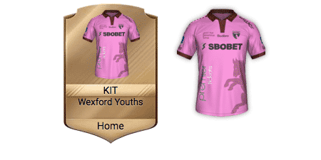
Sometimes you just want a pink kit, and Wexford have you covered. They may be one of the lowest rated teams in the entire game, but their home kit is one of the best – supposing you like the slight garish look. The horse on the side and the brown detailing all look great, so if you are set on pink, look no further.
The Netherlands Away

The great thing about international kits is that the don’t have ugly logos, and that allows the good ones to really shine. Sure the dutch may be famous for their orange, but it’s their blue number that caught my eye. They’re just nice colours. It’s actually the details that makes it work, with the number, the logo and the nike tick all in the same blue as the sleeves and socks. It’s understated but very nice.
Dynamo Dresden Home

This simple kit is made by the faint triangular pattern on the shirt. Gold is in this year, and the black shorts help to bring out the vibrancy of the colour. This is just a nice and simple kit. Shout out to Dresden’s away kit, which narrowly avoided this list due to its boring white shorts.
Australia Home

This may be a little bit biased because I am Australian, but tell me that isn’t a nice kit. The diagonal stripes add a sliver of complexity to the shirt, and the green socks tone everything down just enough. It’s a bright kit, but it’s also a great one, even if that’s overly patriotic of me to say.
U.N.A.M Home

These guys usually have great kits, but this year’s is fantastic. As is becoming a theme on this list, the kit features two main colours, but it’s the details that really set it apart. First thing you notice is their logo smack in the centre. Then you notice it’s surrounded by intricate images, almost like the logo is some sort of god. But it’s yet another gold kit catching the eye, this time carried off by the navy blue detailing. Fancy.
Girondins de Bordeaux Alternate

Atop this list is a controversial one. Bordeaux’s other two kits are so boring, its clear all of the creative juices went into this third one. It’s a stunning collage of the city’s best attractions over a nice deep blue. These sorts of things can often be too busy for their own good, so the designers only used pink, purple and blue to highlight each frame. The result is a homage to the French landscape and a spectacular kit. It is popular though, so you might be set back a little bit more than the rest on this list.
So there we have it, my top ten kits in FIFA 17 ultimate team. EA are bound to release some amazing kits for squad building challenges or FUT champions, but these are ones you will always be able to get without having to worry about missing the boat or just sucking.
And, as a reward for reading this far, I’ve picked three awful kits you could get it you wanted everyone to hate you.
Norwich Alternate

Norwich have a hard enough time every year keeping their yellow and green from being too much of an eye-sore, but they shot themselves in the foot with their alternate kit. What is this? A few blobs of paint on a boring white background? It actually looks like a camouflage design, which isn’t a great start, but without any dark colours it ends up looking like a pyjama shirt.
Cobresal Away

Their logo is kinda cool, but their away kit is a travesty. Orange is a difficult colour to begin with, but the forest green sleeves and the spattering of logos really don’t help. What kills it is the Doppler effect running down the middle. Just why?
SV Ried Away

This kit looks like the designer was asked to make a something that looked like a race car, and then got his idiot intern to finish it. So many logos in so may weird places. Why exactly would Redoit Montagen want their advertisement on every player’s crotch? Then there’s the big white square on the front and the weird green patch on the left sleeve. I get that not all teams can charge 50 million a year for one Chevrolet logo, but at least set them out nicely.
Come on.

